in the three weeks we've been in the new apartment, we've put up a grand total of one picture; the others are clustered at the edges of the bedroom and the living room like seventh graders at their first dance. it takes time to know where pieces should live, you see; i can hardly be expected to hang the debbie harry needlepoint above the sectional before the sectional materializes* (before the holiday guest visits begin, o furniture gods, if you are merciful). the marina towers painting could hang above our bed, but what if the bedroom stayed white? we did manage to figure that out this weekend; it did not.

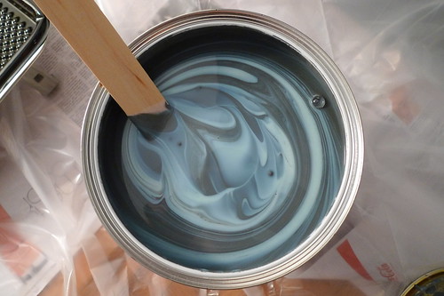
this is down pipe 26, a deliciously deep grey by farrow & ball. it's somewhat costly paint, but it's excellent paint; i decided it was worthwhile to spend a bit more for the good stuff (and two cans, even two fancy cans, aren't so very much anyway).*** i found said paint via the lethally stylish ab chao, whose paradoxically airy down pipe louisiana bedroom (inspired by abigail ahern) has been pinging around design blogs for the past few months. check out our insta-velvety wall, you guys:

we weren't trying to make our room a louche den of mystery,**** but as i finished the second coat yesterday evening, little faux-goth lauren back in 1996 sat up straight with a sudden premonition of future excellence. you're welcome, baby bat.
*we've been told that this could take up to twelve weeks, for we ordered it in "charcoal" (the nerve!) rather than "walnut" or "ale."** i miss the instant gratification of craigslist furniture; new shit is overrated.
**has using beverage imagery for upholstery fabric ever been a good idea?
***the hypersaturated color is fantastic, and the paint itself is zero VOC by EPA standards. i'm also a firm supporter of f&b's marvelously english color names (other favorites: porphyry pink, dead salmon, churlish green).
****speaking of, we accidentally knocked off a 101 in 1001 {II} list item (065 have a drink at a sneaky-sneaky hipster bar) by following friends to the hideout in brooklyn on friday. note to self: bourbon and orgeat play very well together.

Very nice. J. painted her room gray when she was twelve, after a paint-chip fuckup accidentally rendered the room pink: not to be borne.
ReplyDeleteDead salmon? Churlish green?
ReplyDeleteYou know how I dig grey. It looks good, batlet.
At least half of your genetics are violently opposed to white walls. The polar bear looked particularly good in the cabernet bathroom on Humboldt.
ReplyDeleteThe grey is wonderful!
@P: joe has been agitating for "sea foam green" (his descriptor) in the living room, but i grew up with that color in my bedroom; though i do like it, it would make me feel twelve. i was a churlish twelve.
ReplyDelete@A: and "pale hound," and "elephant's breath," and "mouse's back" - o, the english. i dressed french for you today, by the way.
@Ma: if only i'd inherited your steady hand with trim! i'll be redoing that tonight.
Churlish green sounds like the best paint color. I have always been curious about the people who name paint colors.
ReplyDeletedown pipe also had a cameo at the met for last summer's turner exhibition; it covered the gallery featuring his burning-of-parliament paintings. go go art geekiness!
ReplyDeleteNow if only I could get my wall to look like that swirly bucket of paint.
ReplyDeleteoh i love it! i like what rachel said... churlish green is a really odd name! love the first photo of the swirly paint. xoxo
ReplyDeletebeen trying to motivate to paint our living room for *weeks*
ReplyDeleteyears really, but with renewed intensity
My favourite farrow and ball names are Dead Salmon, Mouse's Back and Elephant's Breath. The sitting room in our old flat was Eating Room Red and I want to paint our kitchen Borrowed Light. Mostly just because I like the name.
ReplyDeletethe bungalow is primarily biscuit. with shit brown accents in the kitchen and a few cayenne walls in the bedroom. we've never bothered to repaint (obv). but. damn.
ReplyDelete