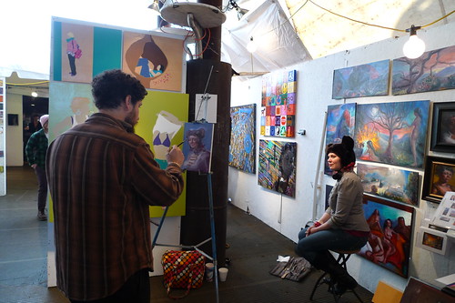
i really do want to tell you all about fountain art fair, the exhibition we hit on saturday - the venue was terribly sexy, the works were grand, and it was poignant to revisit the show that first led us to the gaf - but today it's mostly an excuse to find out how you feel about how kidchamp looks now that it's migrated back to blogger (bah) and mutated a bit. asking for feedback when i lack the tech skills to respond with gusto isn't especially wise, sure, but "sudden and often questionable aesthetic decisions" is my middle name. (bet you didn't know 'maria' could be translated that way.) so, er, what do you think?

8 comments:
Looks swell. What's prompted the migration, asks one thinking of going the other direction?
blogger's pulling the plug on FTP publishing, so i had to throw the whole site over to them. paul, my long-suffering host and default web medic, strove mightily to migrate the site over to wordpress - my strong preference was to keep the site with him - but the move got too ugly. that's unsurprising, given that kidchamp is an ancient blogger template i first started hacking about eight years ago + haloscan comments upgraded (messily) to echo + flickr + random photobucket. i no longer know how to build the sort of table i slapped together for this layout; i tend to learn code just long enough to make a tweak and then forget it.
I will miss the light celadon but I will grow accustom to the light periwinkle.
but i can read this one at WORK!
is it odd that for a minute i thought the artist was joe (and thought, hm, has he let go of himself a little) and the sitter maggie gyllenhaal?
odd though, the header photo doesn't show up at work.
@jamie: joe is fond of painting maggie, of course, but she was out of town on saturday (peter sarsgaard and his supercomplicated oscars cummerbund, y'know). that's strange about the photo - something to do with photobucket? (i've never used it before, but it seemed like a good option for adding photos to my template). is there a more universal image hosting site?
@MDF: i have, no joke, extremely strong feelings for green, and feel kind of bereft without my clashies. was going for more of a farrow & ball elephant's breath - a slightly warm thistle-lavender somethingorother - but have paused here in the interim. might stay?
redesigning the blog is tricky...i'm there myself. sort of. i'm also planning to reclaim my url via auction, but may become furiousmuse.net in the end? who knows. enough about me though...
i appreciate how you've tried to maintain the essential elements of your blog--what made it recognizable as "yours." i'm undecided about the giant photo header though. it takes up substantial space (the photo is fantastic though).
Slightly taken aback by the color change, but I'm already starting to like it.
Love the header photo but it is a bit large, perhaps.
So glad that it still looks like you around here. I'm guilty of tweaking and forgetting as well. I google what I want to do, go into the html and mess around and then never remember what I did later. And blatantly disregard the recommendation to save a copy of your template before starting to mess with it. So far, I've been lucky.
i think you kids could be right about the size. tweaked a bit accordingly.
Post a Comment